REBRANDING For 110 years the International School of Philosophy ISVW has been the best place for clear thinking. De school attracts the best philosophers and world’s great thinkers.
The historical location of the institute is the starting point of the rebranding. Graphic, dynamic logo shapes transform into animals that live in the environment of the institute. The new logo honors the estate and the forest as natural wealth and basis for clear thinking. Colors for the new corporate identity were found by zooming in on moss, leaves, the bark of a tree. The logo visualizes space: as thinking and as physical place. In addition to ISVW as a word mark the image language is friendly and recognizable. You can create endless new ones with the individual blocks. Over and over again. For example, a tree, a moon or an animal. What does a bird think? The logo cares about all thinkers. The owl, the badger, fox, wolf, boar and deer honour the estate, and the letterforms symbolize thinking directions. You can make a triangular block from a letter ‘v' that could be an owl's beak, but also a starting point, a new direction. The new dynamic logo shows that it is possible to create an endless brand with just a few colors and minimal shapes. A language that fits all communication. From screen to print, from paper to the stage.
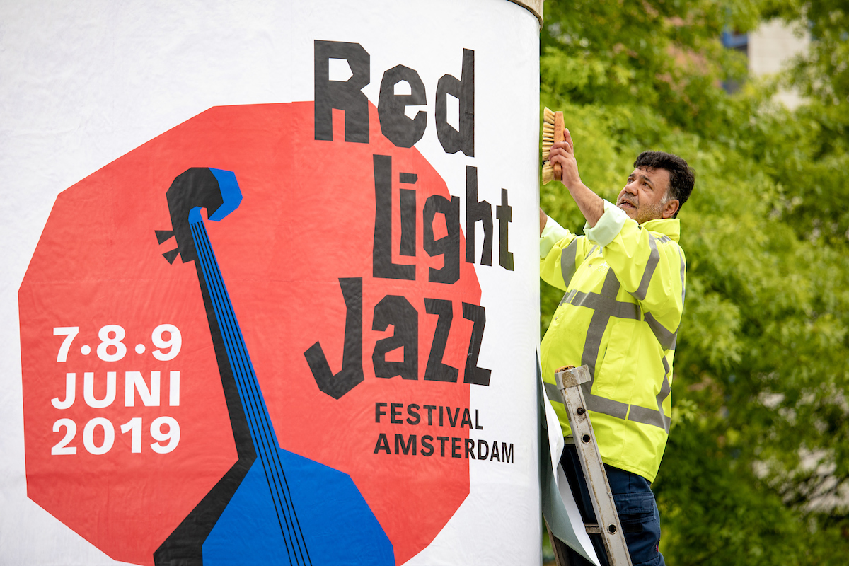
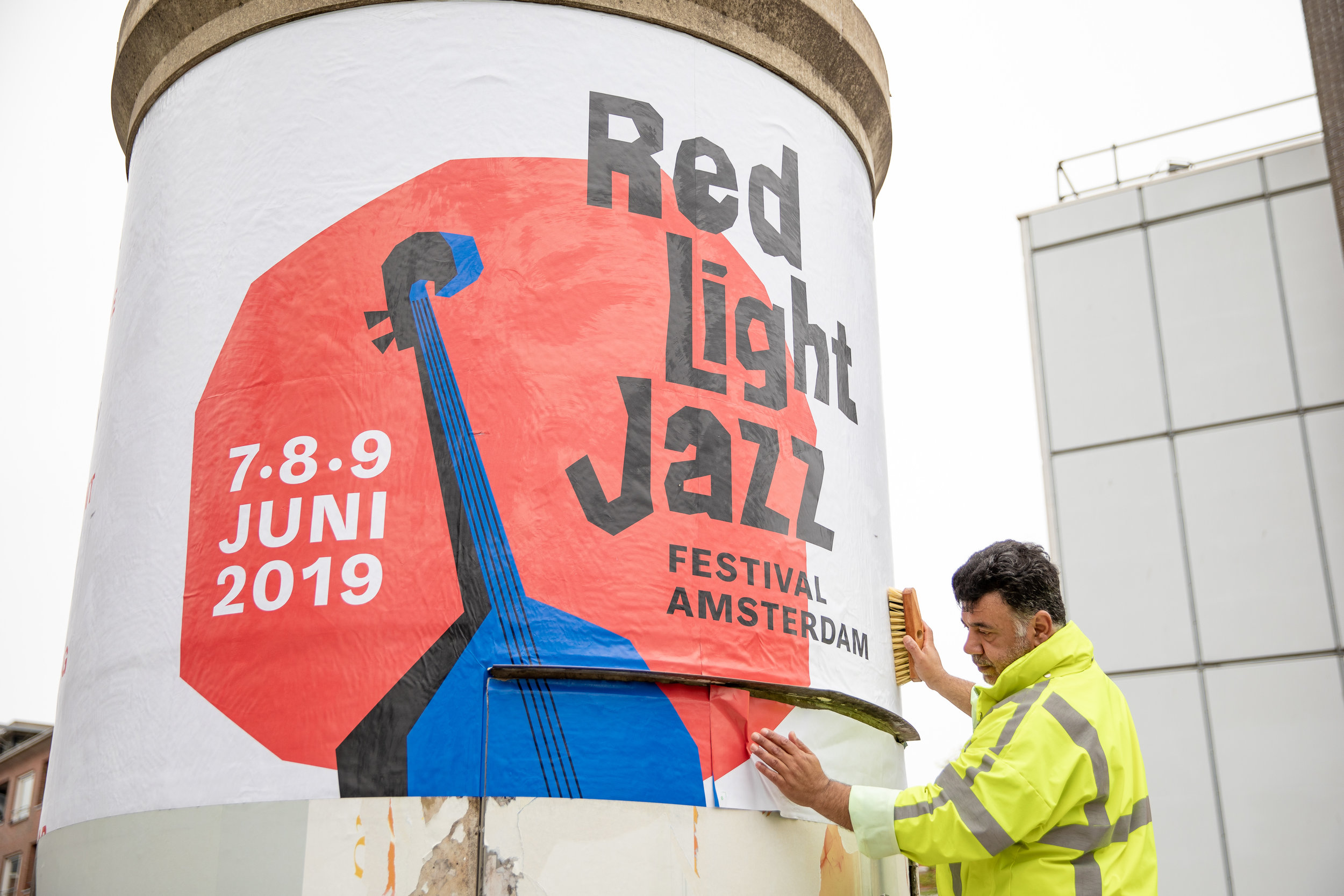
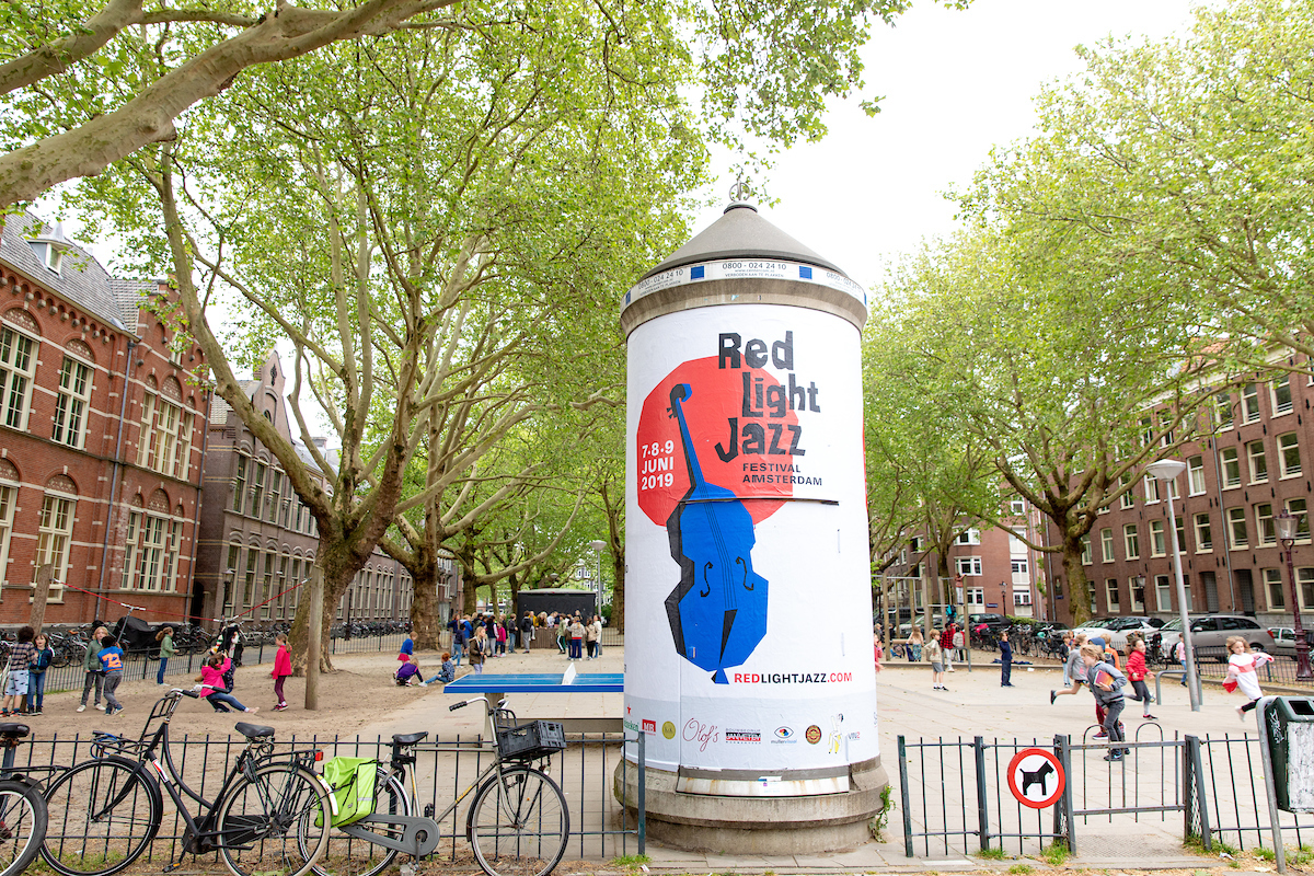
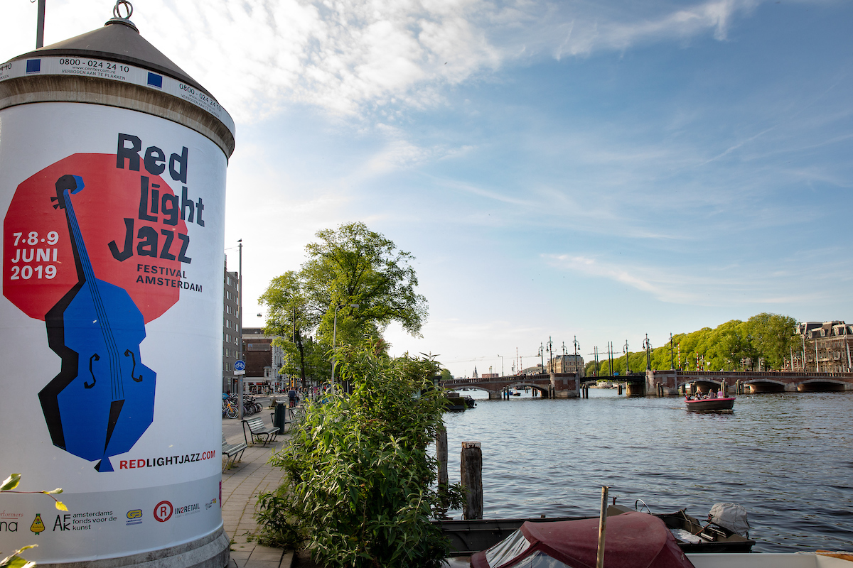
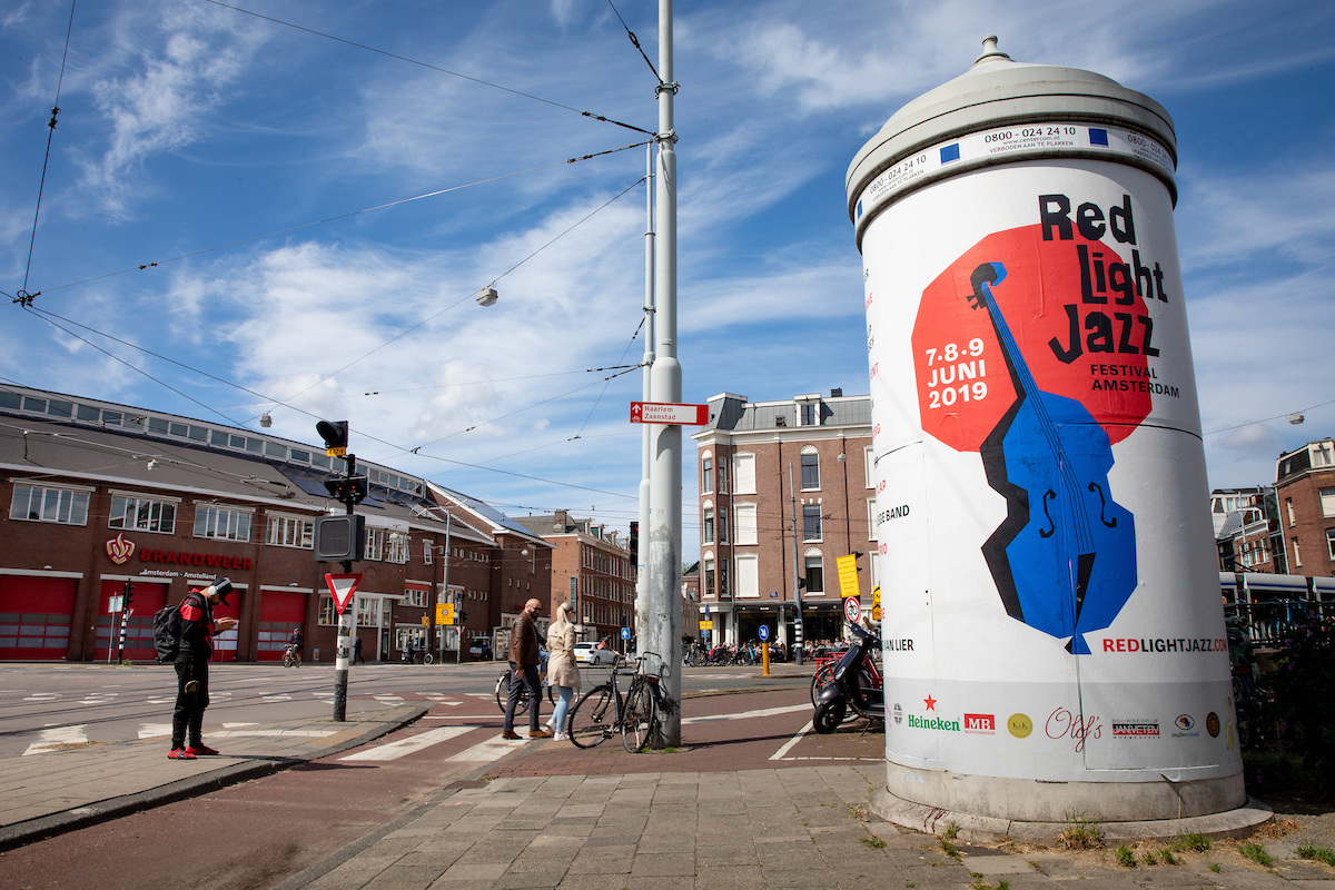

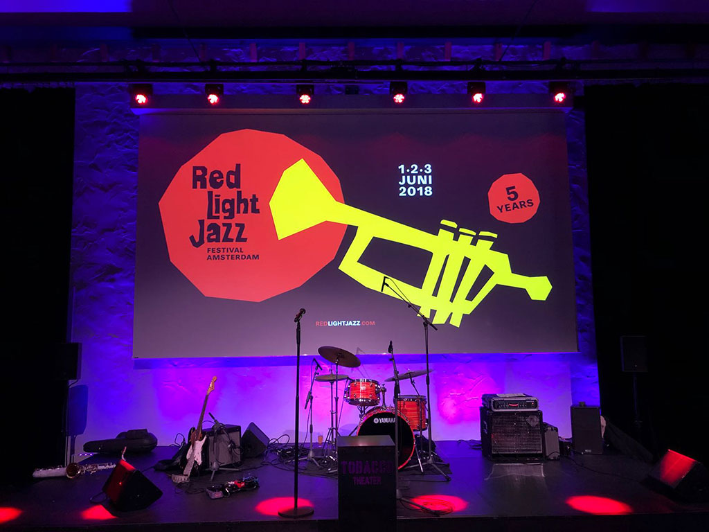
LOGO AND VISUAL IDENTITY for the jazz festival in the red light district of Amsterdam. © photos: Bas Uterwijk.

Brand philosophy identity for VESCOM, the biggest player in high-quality interior products for the international contract market.


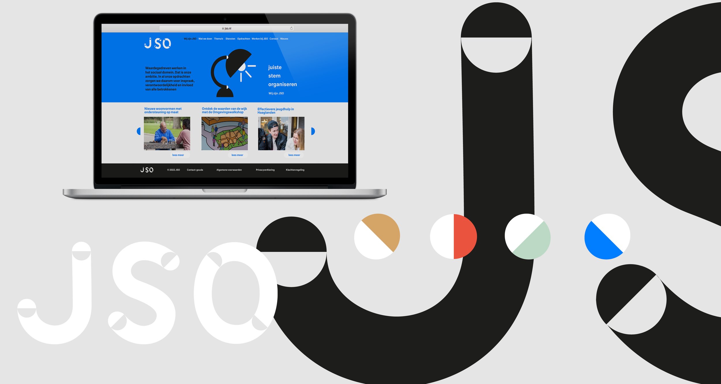
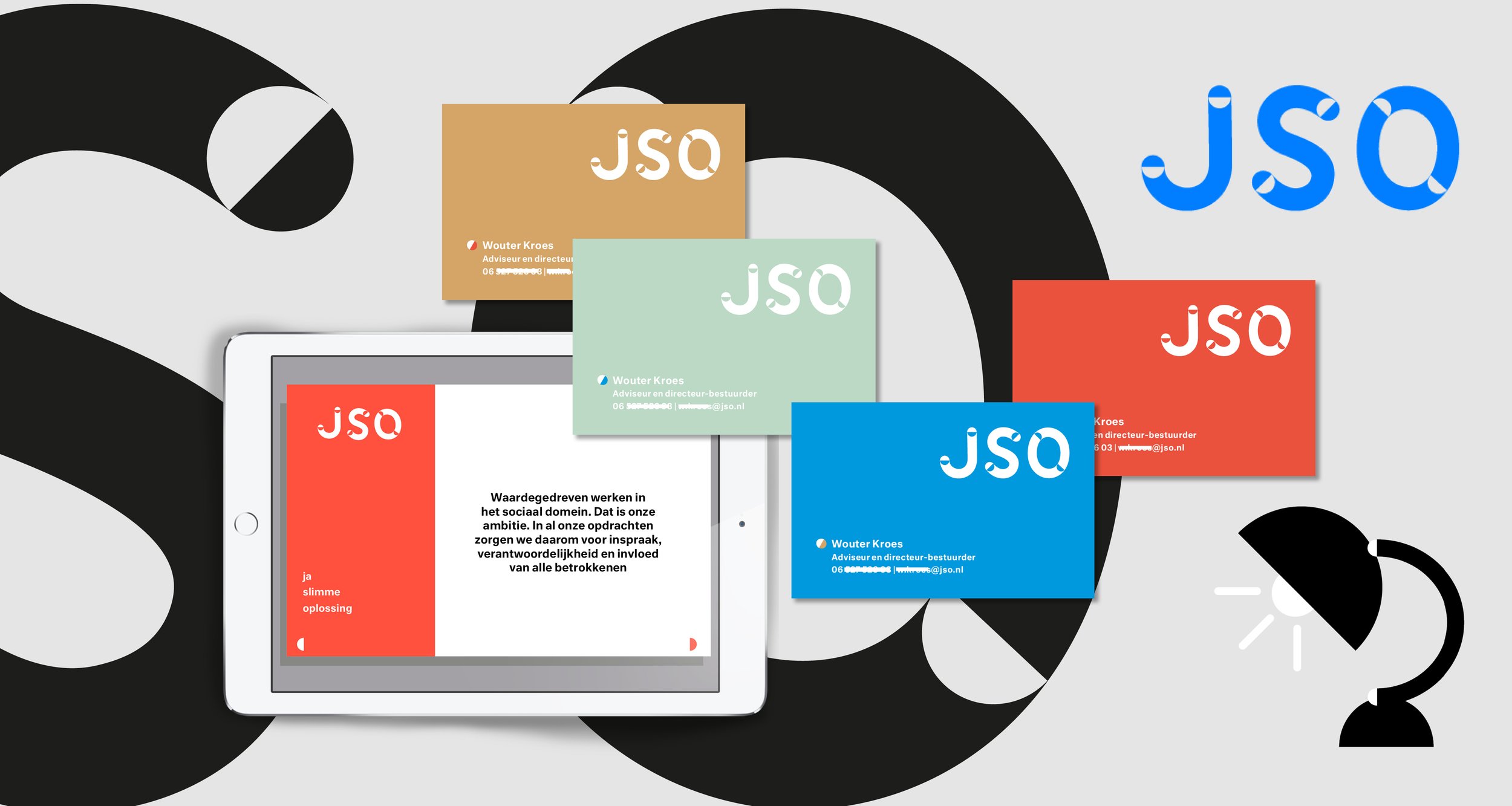
BRAND LOGO DESIGN Revaluation of the brand name, reducing the substantive meaning in three key words. New logo, icons and corporate identity. JSO helps municipalities, implementing organizations and the government to solve social and organizational issues.
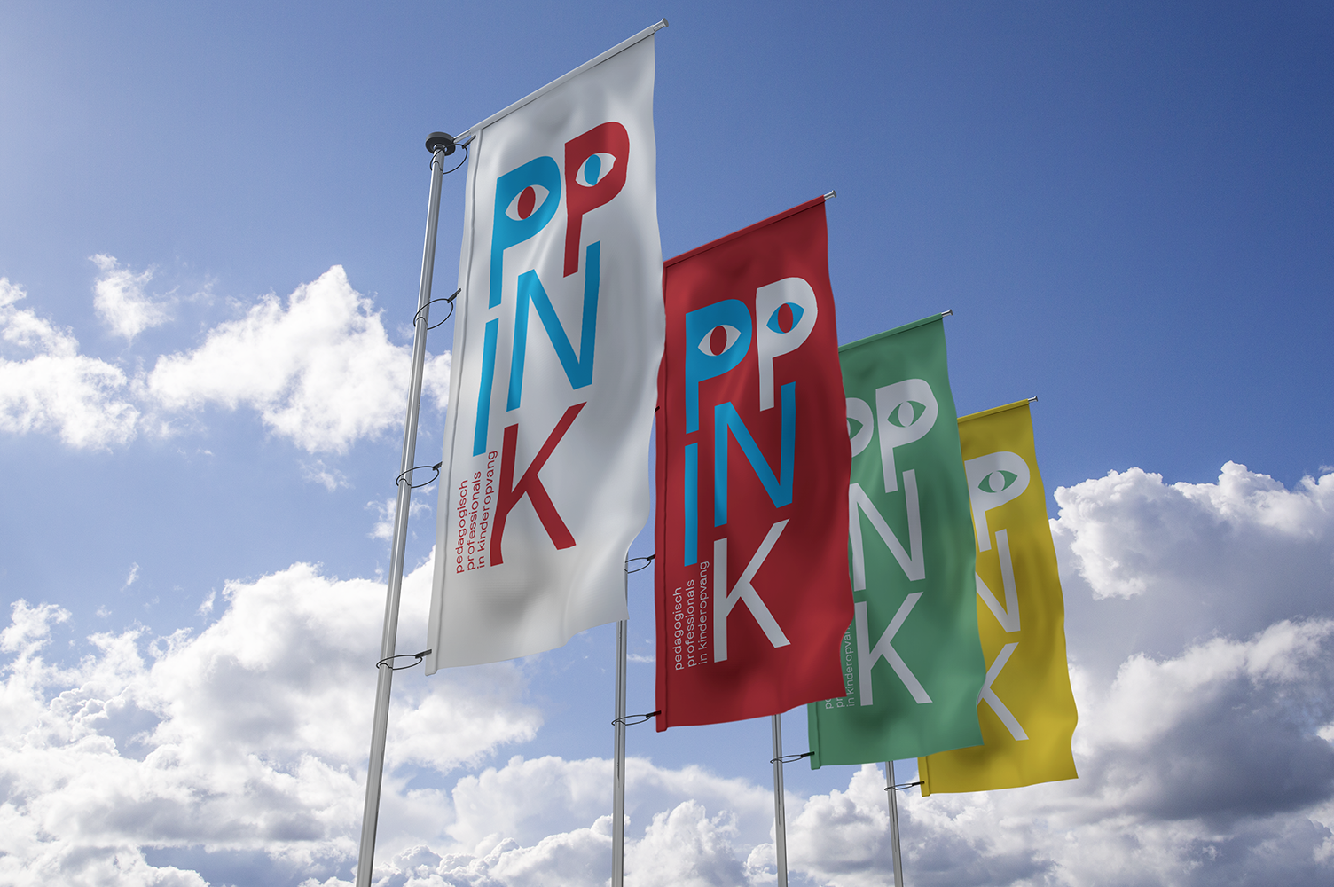
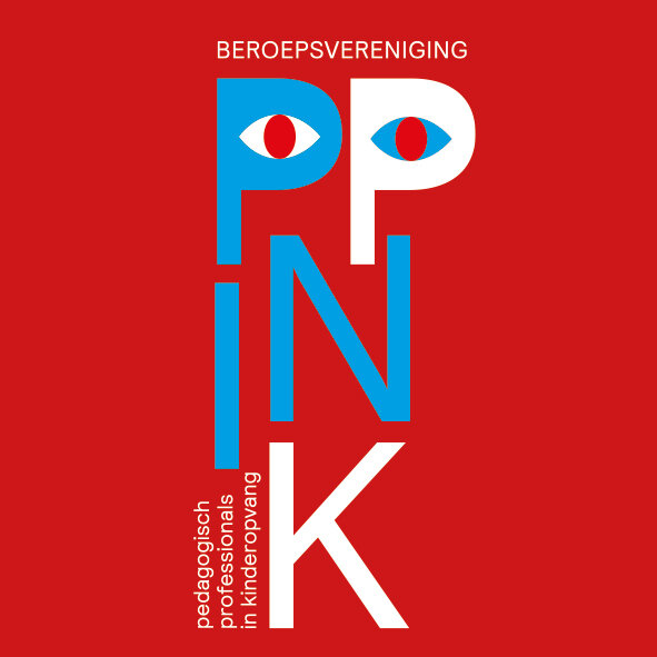
Logo and brand identity for the dutch association of pedagogical professionals in childcare.
BRANDING AND MAGAZINE DESIGN.
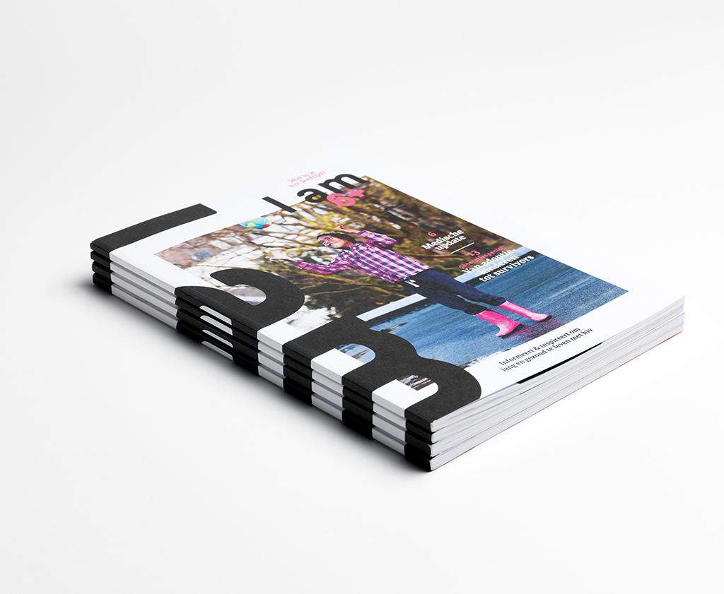
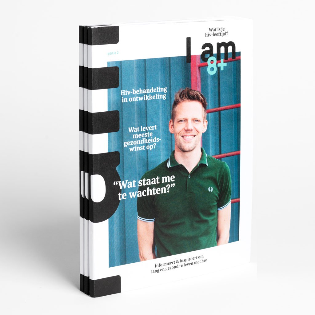
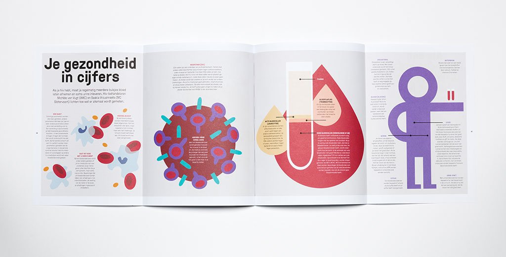
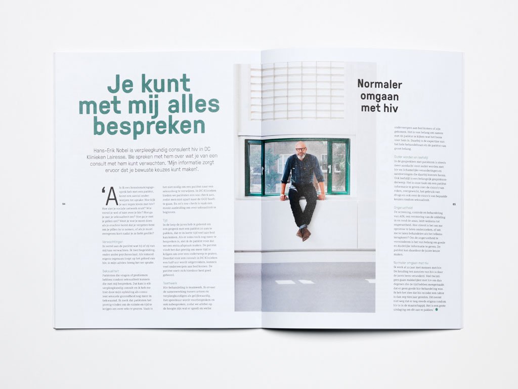
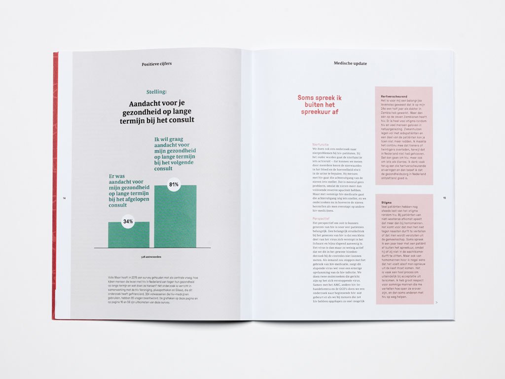
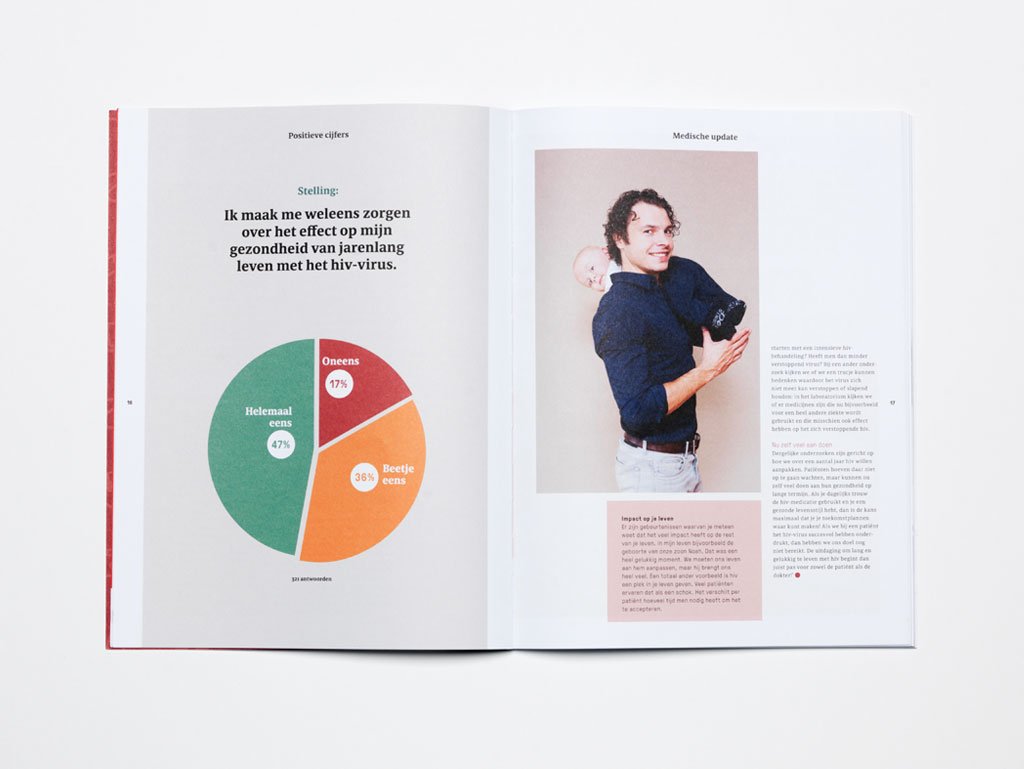
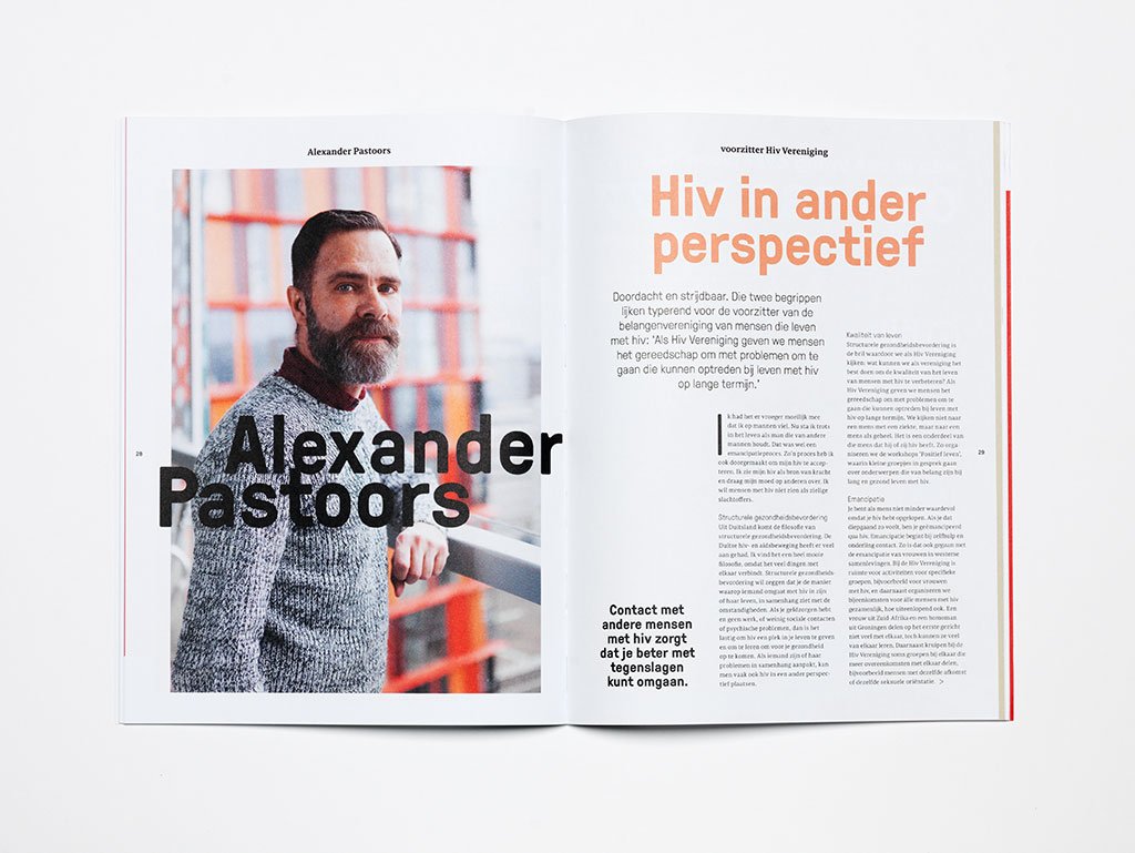
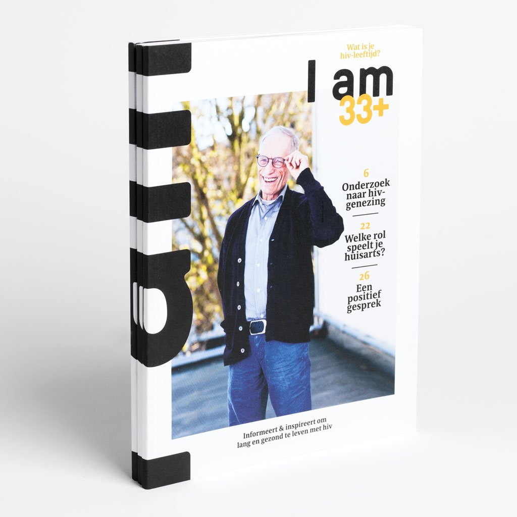
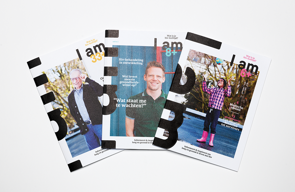
I AM+ magazine inspires and informs HIV-positive people living in the Netherlands to lead long and healthy lives.
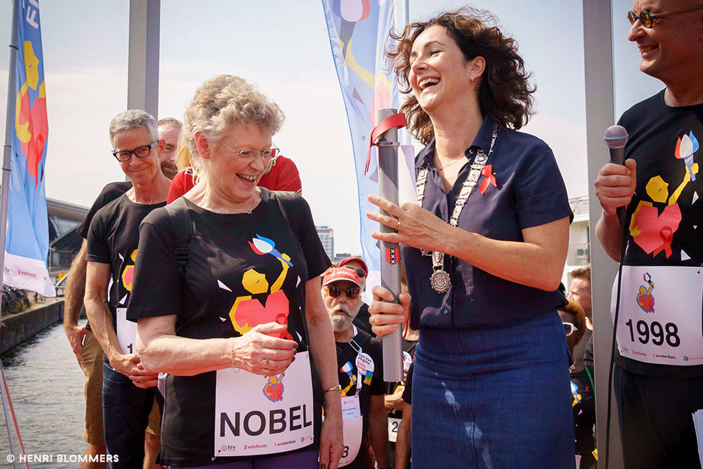
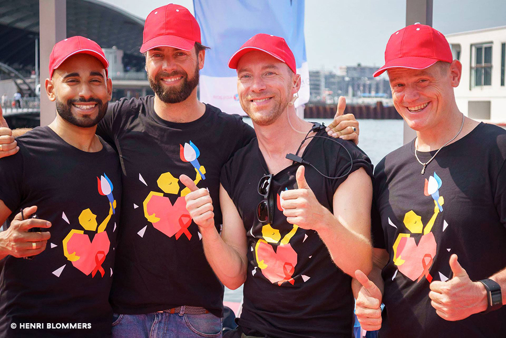
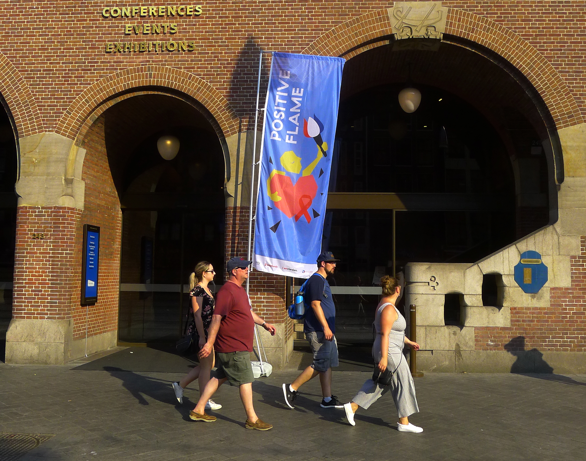
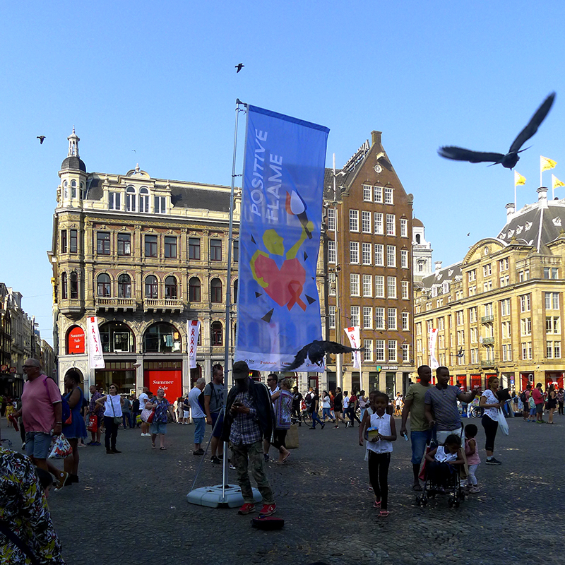
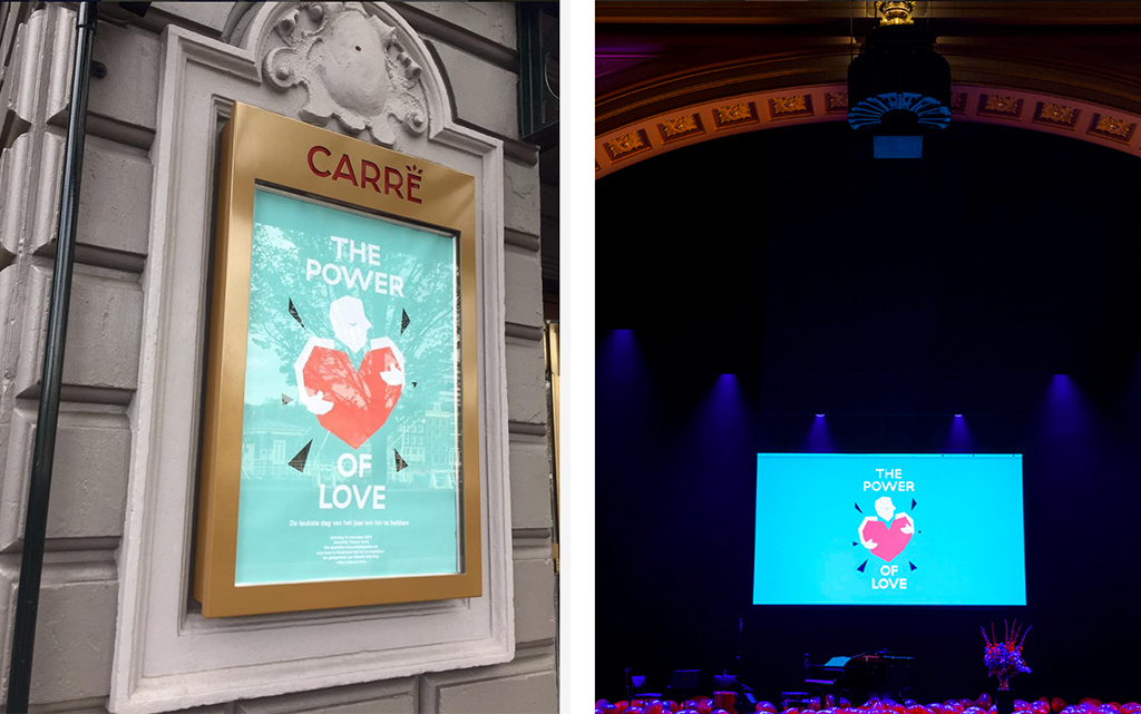
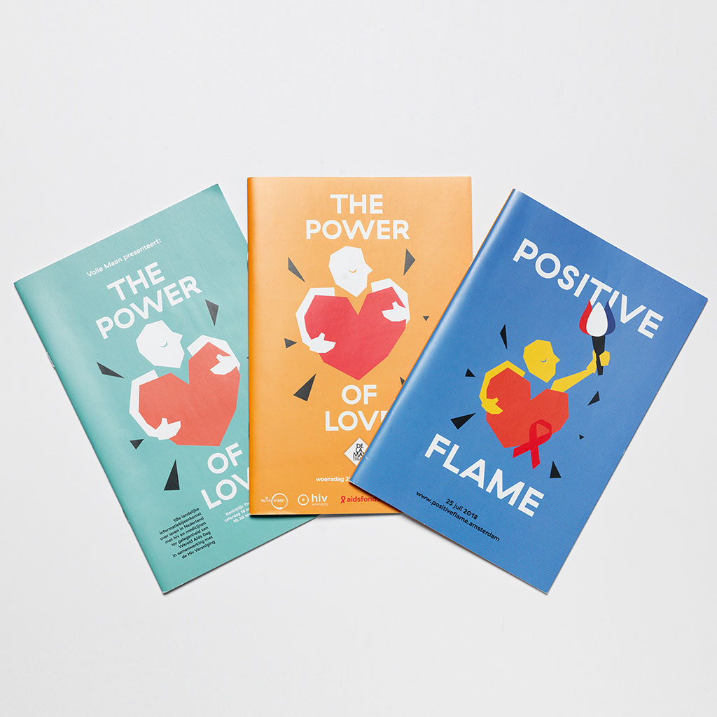
BRAND DESIGN The Power of Love is the annual event for people living with HIV and AIDS and their loved ones, that intends to inform, to inspire and to bind.
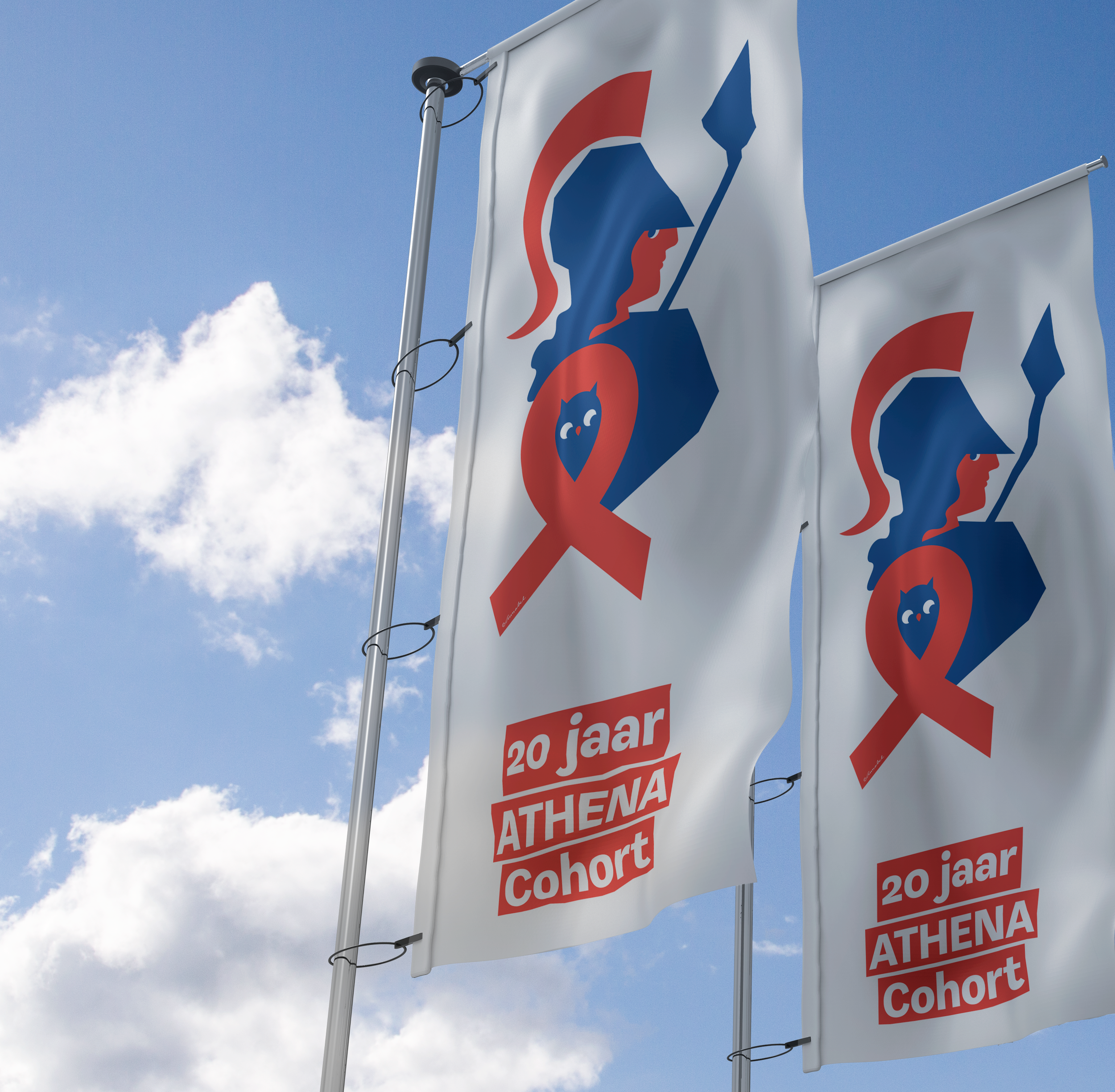
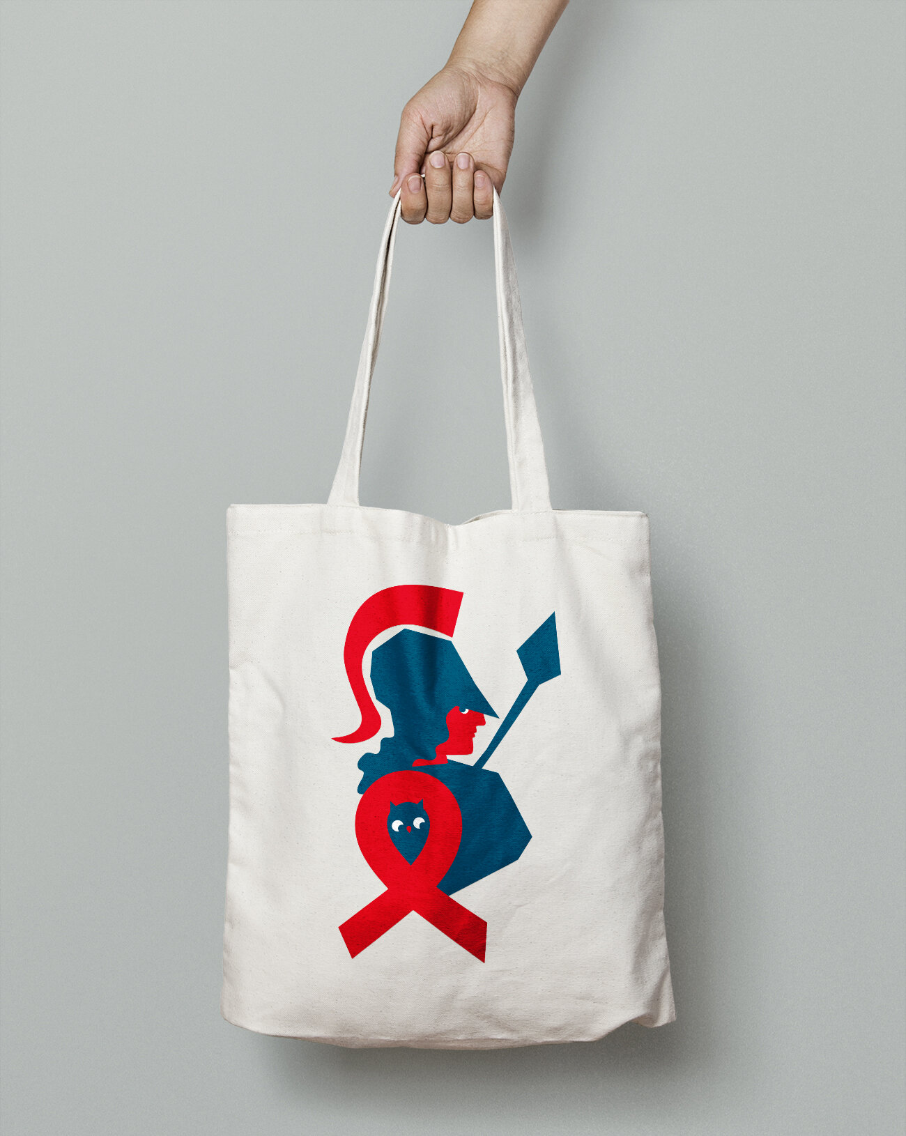
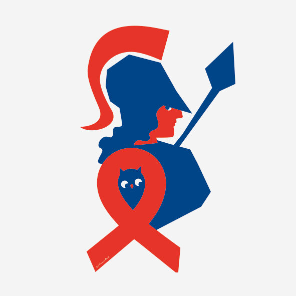
IDENTITY DESIGN. To celebrate the twentieth anniversary of the large research study, the ATHENA cohort study, SHM asked to create a logo in which the goddess Athena and the red ribbon are combined. Stichting HIV Monitoring’s mission is to further the knowledge and understanding of all relevant aspects of HIV infection in HIV-positive persons in care in the Netherlands.
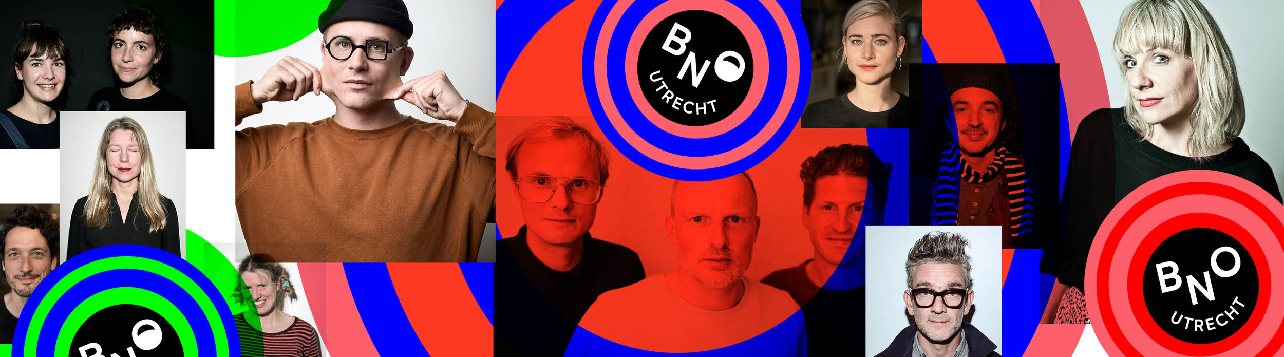
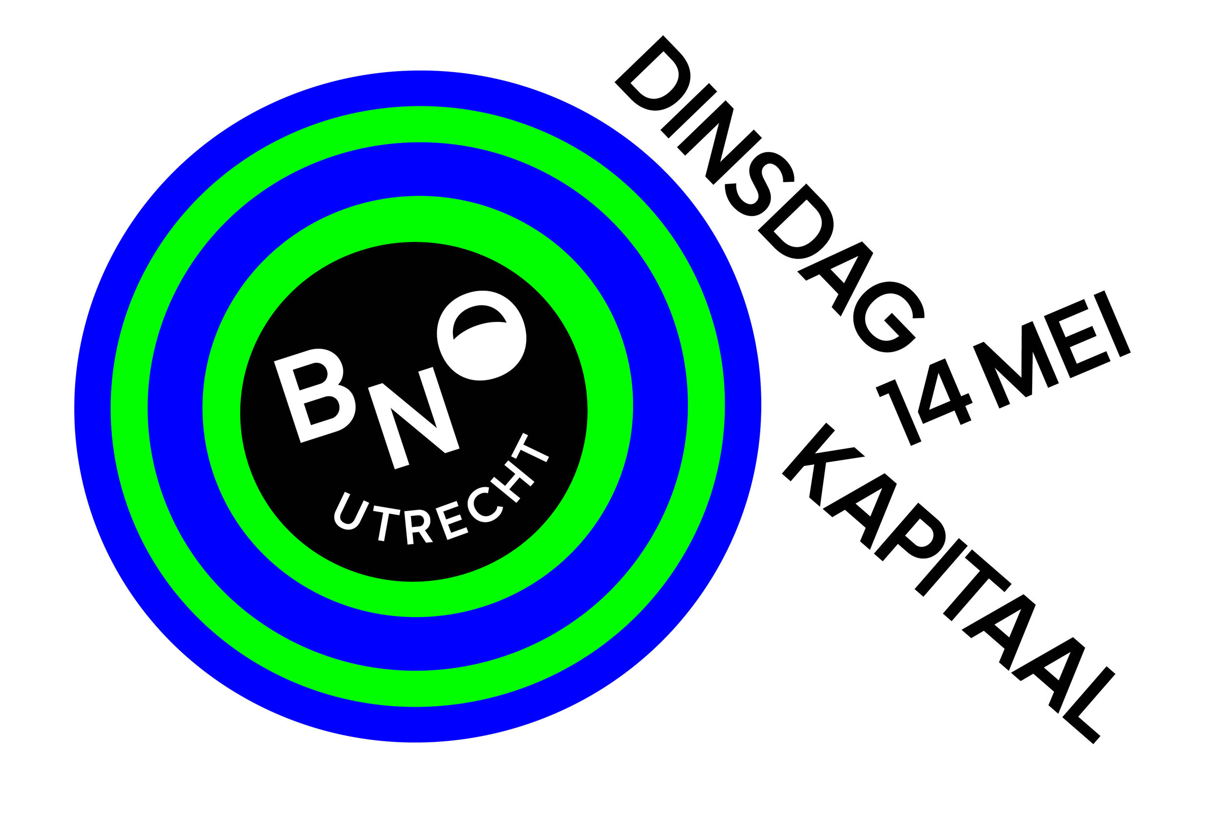
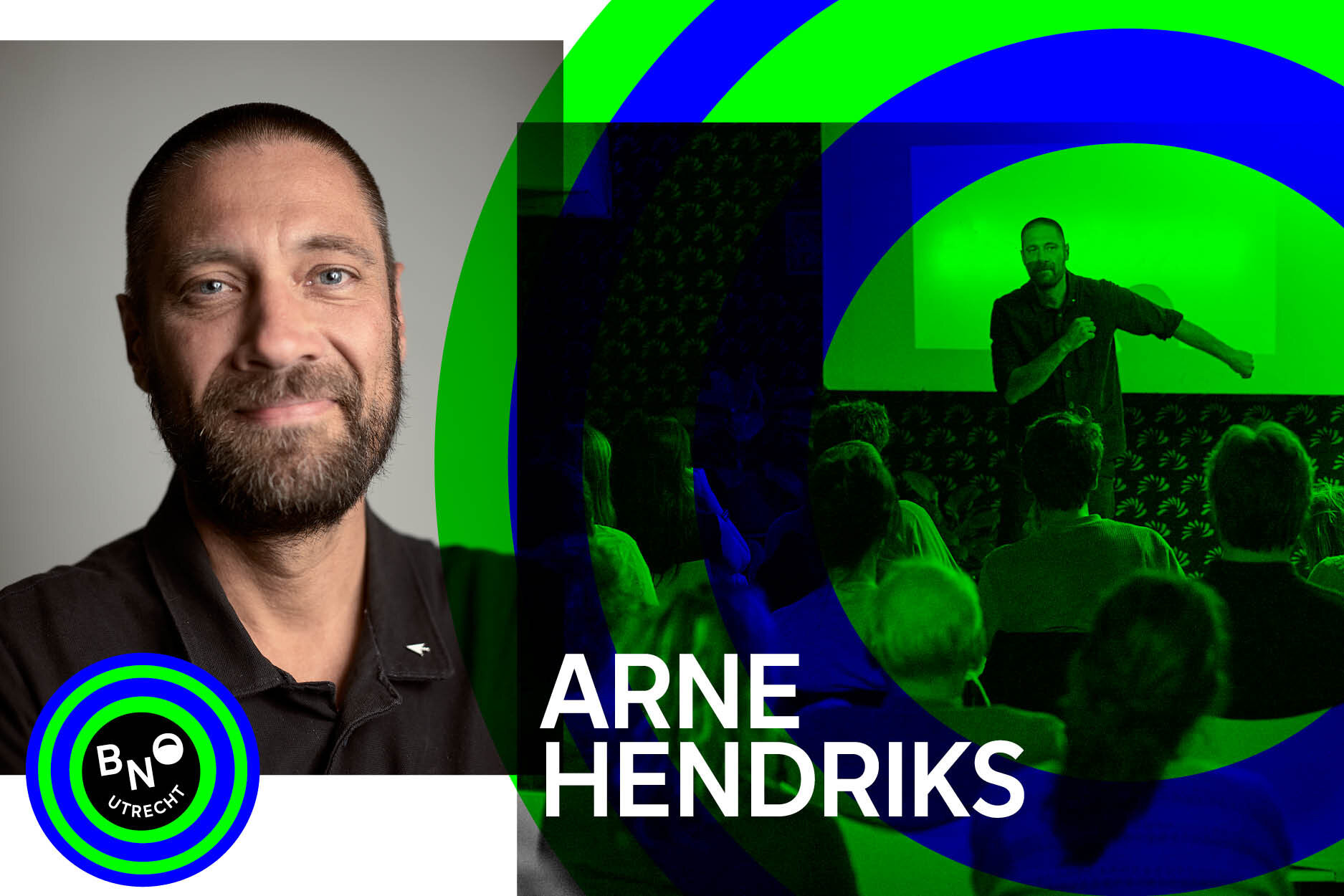
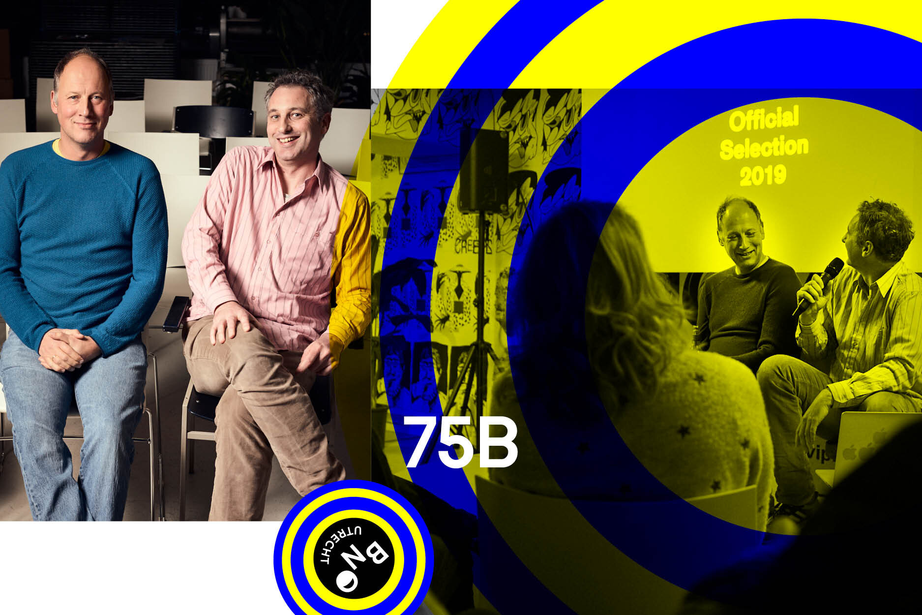
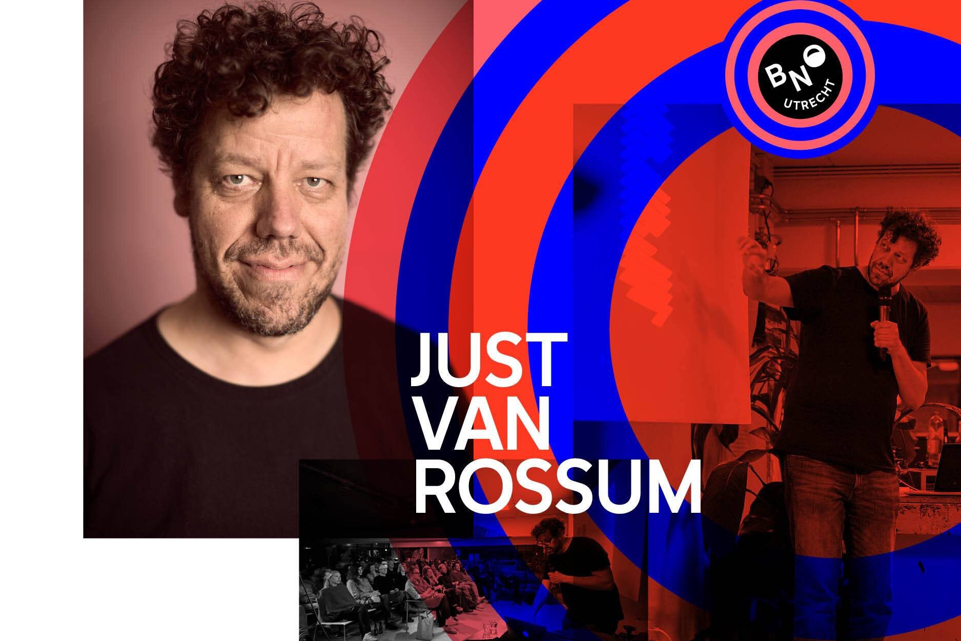
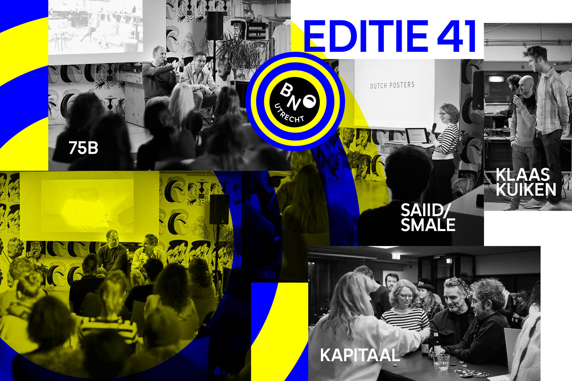
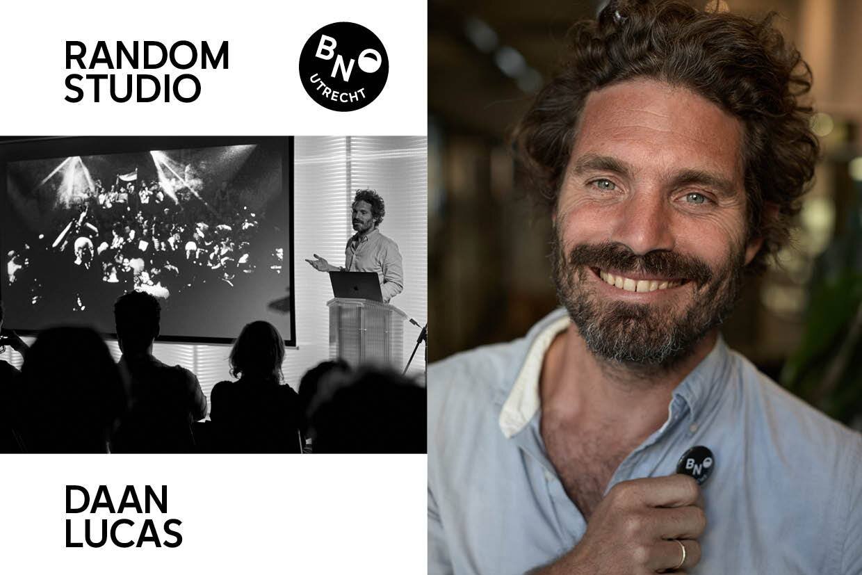
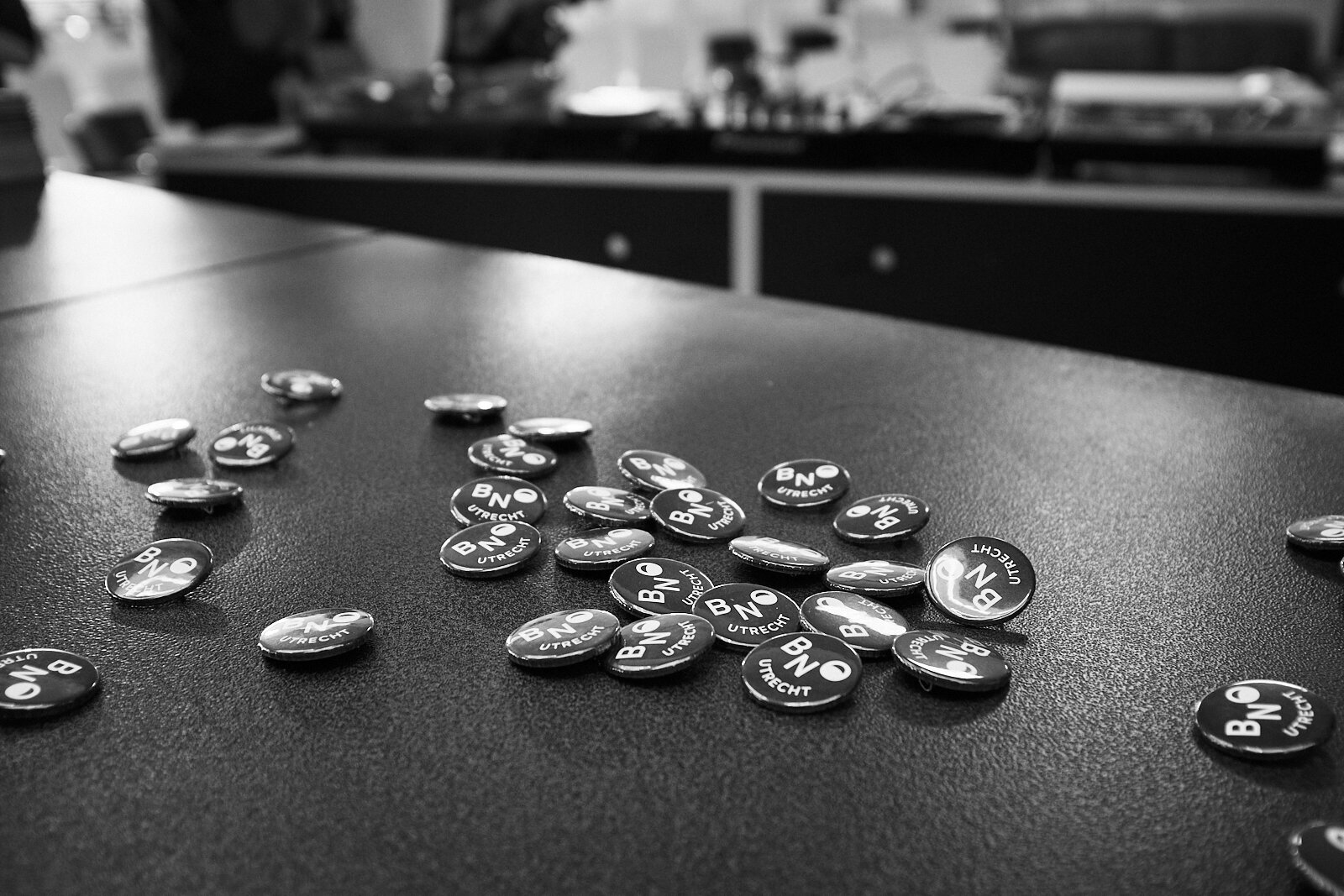
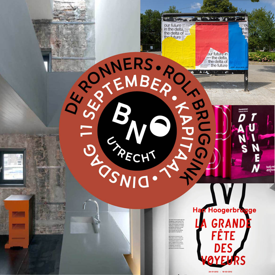
LOGO AND BRANDING. BNO is the largest community of designers and design agencies in the Netherlands. BNO UTRECHT curates and organizes inspiring evenings with speakers from the (Dutch) designers community. Meeting and inspiration as a starting point for the logo. © Portraits by Thomas de Wit.